Project overview
About ReportLinker
ReportLinker is a SaaS platform that provides access to a comprehensive collection of market research reports, helping businesses and professionals stay informed about industry trends and make well-informed decisions.
The platform serves as a hub for market research reports, industry analysis, and statistics compiled by leading market research firms, publishers, and analysts.
Client: ReportLinker | Role: UI Designer | Date: November 2022 | Team: 7 members
ReportLinker
ClientUI designer
My role
Nov. 2022
Year
1 Stakeholder
1 Customer success lead
1 Data Analyst
3 Developers
7 Team members
My contributions
UI Design
Ilustrator
Prototype
Figma / Adobe XD
Doc Design
PPT
Integration
Gitlab, Less, Vue, Tailwind
cONTEXT
Users seek rapid market analysis
Users required a comprehensive overview of the happenings within their industry of interest, but in a quick and efficient manner.
This would enable them to quickly scan through the options and select the ones that piqued their interest the most for a detailed examination.
Solution
Empowering Comprehensive Market Insights
The product design team came up with the idea of creating a new feature that addresses this commonly demanded user need.
After some discussions on how to name it, we called it Analytics.
The objective of the project was to bridge the existing gap between analysts and various stakeholders within a company to provide a comprehensive view of what is happening in a market, region, or industry very quickly.
Analytics will enable users to go beyond their knowledge of a segment, competitor, or market through the data generated by ReportLinker’s AI.
THE CHALLENGE
Sentiment Analysis Feature Unveiled
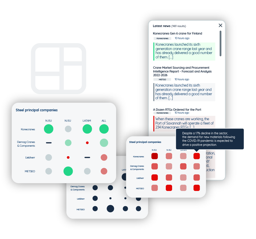
We encountered some technical constraints. The R&D team was still in the process of developing a feature called Sentiment Analysis (SA).
The purpose of this feature was to offer users a rapid overview of the top-performing and worst-performing sectors. From a visual standpoint, it would employ a color-coded system with three variations: green indicating positive performance, red indicating negative performance, and gray indicating neutral performance.
These color codes would be utilized to emphasize news excerpts that users come across on the platform. The completion of this feature was essential to initiate the project.
Kick-off
WHY and WHO (Strategy)
The first step was to define why we were undertaking this project.
To achieve this, we needed to empathize and actively listen to users in order to better understand their needs. This allowed us to work towards developing a solution that would effectively assist them.
We found out that the reason is that many users require quick visibility into their sectors. This is something commonly requested in interviews with the sales team, and the platform was not efficiently providing it. The sales team constantly listens to users and shares the most recurrent needs with the product team.
The target audience includes analysts, researchers, and business intelligence managers.

Head of Sales Development
- Sector: Steel manufacturing company.
- Objectif: Suivre et anticiper différents types de mouvements sur les segments d’activité de l’entreprise, dans différents territoires, et leur acteurs associés.
- Challenges: Commercial. Being able to adapt the business activities to the signals detected in these markets.
WHAT (Scope)
Introduce a new feature that serves as a bridge, connecting analysts and various stakeholders within a company, to deliver a comprehensive overview of market, regional, or industry developments.
This feature will effectively present and make the extracted information from the platform easily understandable and accessible.
Based on users’ recurring inquiries, we identified the key questions that this tool needed to address:
- Which regions of the world are they interested in monitoring?
- Which actors do they want to follow?
- Which sectors are they interested in?
- What are the indicators that allow them to evaluate the health status of the monitored markets?
Ideate
Structure
We established the information architecture and navigation to outline the user interaction and navigation within the existing product features. The creation of workflows allowed us to quickly identify pain points when users attempt to accomplish a task.
Additionally, it enabled the frontend team to establish a more logical workflow for development tasks.

Benchmark
We explore and search for data visuals that can help us achieve the objective of the feature: providing a quick and comprehensive overview of market, regional, or industry developments.

Wireframes
The product team created wireframes to visualize and refine their conceptual ideas. I delved deep into it and made adjustments to simplify the concept. During the evaluation of the initial wireframes, it became apparent that the matrix configuration was overly complex.
To enhance usability and facilitate testing, I proposed the removal of unnecessary elements, focusing solely on essential components.

UI Design
Following extensive meetings with the product team, we established the desired elements for this feature. My primary challenge was to persuade stakeholders to prioritize simplicity and reduce the number of interactions, especially for the initial release. Our aim was to gather valuable feedback through testing, enabling us to make necessary adjustments and validate any hypotheses.
To design the UI, I employed Illustrator as my tool of choice. Within this platform, I meticulously crafted all the elements, emphasizing proper alignment, composition, contrast, and legibility to enhance the overall user experience.


Prototype
Once the UI design is validated in terms of colors, composition, and wording, I proceed to develop a prototype. This phase is crucial as it confirms the accurate navigation flow and interactions between different pages.
The prototype also provides the product team with a realistic visualization of the product, enhancing their confidence in what they can expect in the final version. Additionally, it allows the frontend team to observe and better understand the interactions, facilitating the coding process.
In this specific case, the prototype played a crucial role in validating that certain stages in the configuration were still not essential.
This realization led us to simplify the setup configuration even further, ensuring a more streamlined and efficient user experience.

Design doc
We kicked off the project with the frontend team once the prototype had been validated. Prior to this, we had already presented the design progress, gathered feedback, and made necessary adjustments to address technical constraints and UX issues that were initially overlooked.
However, despite providing explanations to the frontend team, it was challenging for them to remember all the details. While the prototype was helpful, they required more specific explanations to accurately bring the product to life as envisioned by the product team.
To address this, I created a comprehensive document called the “Design Doc” specifically for the frontend team. In parallel, the project manager defined the business rules for the backend in a separate, less visually-oriented document.
The Design Doc covers all the UI elements and provides detailed explanations for their presence and purpose, ensuring clarity and consistency throughout the development process.

Integration of the UI
For complex projects, it is the Frontend team that takes charge of the visual integration in the initial stage.
Once they have completed the full development, it is my responsibility to refine and align it with the validated mockups in the code.
For this project they used VUE and I use tailwindcss, a utility-first CSS framework that provides a set of pre-defined classes that helps build user interfaces faster.

The outcome
Iteration process
We conducted a beta test to gather user feedback and assess their response to the feature. Our primary goal was to determine the level of user comprehension and whether the feature effectively addressed their initial problem of spending too much time on research by providing a quick market overview. We also sought to evaluate the usability of the feature.
Based on the answers to these questions, we began making adjustments to the feature. Some of these adjustments included creating deliverables, such as a detailed document outlining the matrix. We also increased the configuration space, as the initial popup was too small. Now, the configuration interface occupies most of the screen, enhancing user comfort during the matrix creation process.
Initially, the matrices were presented in a carousel format, enabling easy navigation between them. However, user feedback revealed a preference for having individual pages open, which facilitated seamless sharing with their teams.
Furthermore, users expressed a need to export the visuals as emails or for easy downloading. This discovery opened new opportunities for future development, aligning with user interests and requirements.
Enhancing Sales Efficiency
The response to this feature has been excellent, as it significantly expedites the sales process on the platform. Users are delighted with a visual product that allows for easy sharing.
Users have expressed their desire for additional enhancements to this feature, and I worked with the product team to diligently fulfill those requests and deliver the best possible solution.