Project overview
About ReportLinker
ReportLinker is a SaSS (Software as a Service) platform that collects and analyzes data from various public sources, such as research reports, surveys, interviews, financial data, etc., and presents them in the form of reports and analyses to help its clients better understand their market and make informed decisions.
Client: ReportLinker | Role: UI Designer | Date: 2019 (divided in multiple MVP’s) | Team: 5 members
ReportLinker
ClientUI designer
My role
2019
Year
1 Stakeholder
1 Marketing manager
2 Developers
5 Team members
My contributions
UI Design
Ilustrator
Prototype
Adobe XD
Integration
Gitlab, Less, Vue, Tailwind
Survaillance
tools
Hotjar, GA(Google Analytics)
and NPS (Net Promoter Score)
cONTEXT
A Navigation Efficiency Challenge
We have a system called NPS (Net Promoter Score), and usually, people who are not happy with the experience leave comments.
It’s there where we can find ergonomic problems. In this case, I didn’t have the opportunity to do research. The product team came to me with the problem and ideas to solve this problem, but reading the comments in the NPS, helped me confirm the frustration of some clients who found the navigation in the platform time-consuming.
Based on that, we built a hypothesis and a problem to solve for them. Users needed the ability to swiftly browse search results to find the most relevant data within documents. Prior to this, subscribers had to search each result individually, opening each document one by one to check for the required data. This method of research was time-consuming.
They didn’t find the value in the product that was supposed to assist them in locating their data as quickly as possible.

Pharmaceutical Manager
- Sector: Drug Manufacturing
- Objectif: Find specific information about generic pharmaceuticals in Brazil.
- Challenges: Time Constraints: Limited time to research and gather comprehensive information.
Data Overload: struggle to filter through an overwhelming amount of information.
Prototyping
Benchmark
We needed to reconsider how our users conducted searches on the platform.
Their main concern was the excessive time spent on finding, scanning, and selecting the documents they needed. To address this issue, we conducted a benchmark analysis of competitor websites and other sites with more user-friendly interfaces than ours. Our findings led us to the decision of adding a document viewer alongside the search results list.
This allows users to click on an excerpt from the document and quickly view and scan its content.
Wireframes
With this conclusion, I started developing wireframes and structuring the information, focusing on the SERP (Search Engine Results Page of the platform).
We tried different structures and had some disagreements in the process. Given that the reading direction is left to right in Western countries, and our target audience primarily comes from these regions, I proposed having the visualizer on the left and the list of results on the right.
The stakeholder didn’t agree with me based on the importance of the list of results and suggested that it could be better to have it on the left to make it more quickly noticeable. I found that it made sense, so we tested it that way.
Years later, someone on the team made the same comment that I did (about the position of the visualizer), and I couldn’t help but think
that we should have tested both versions to see which performed better.
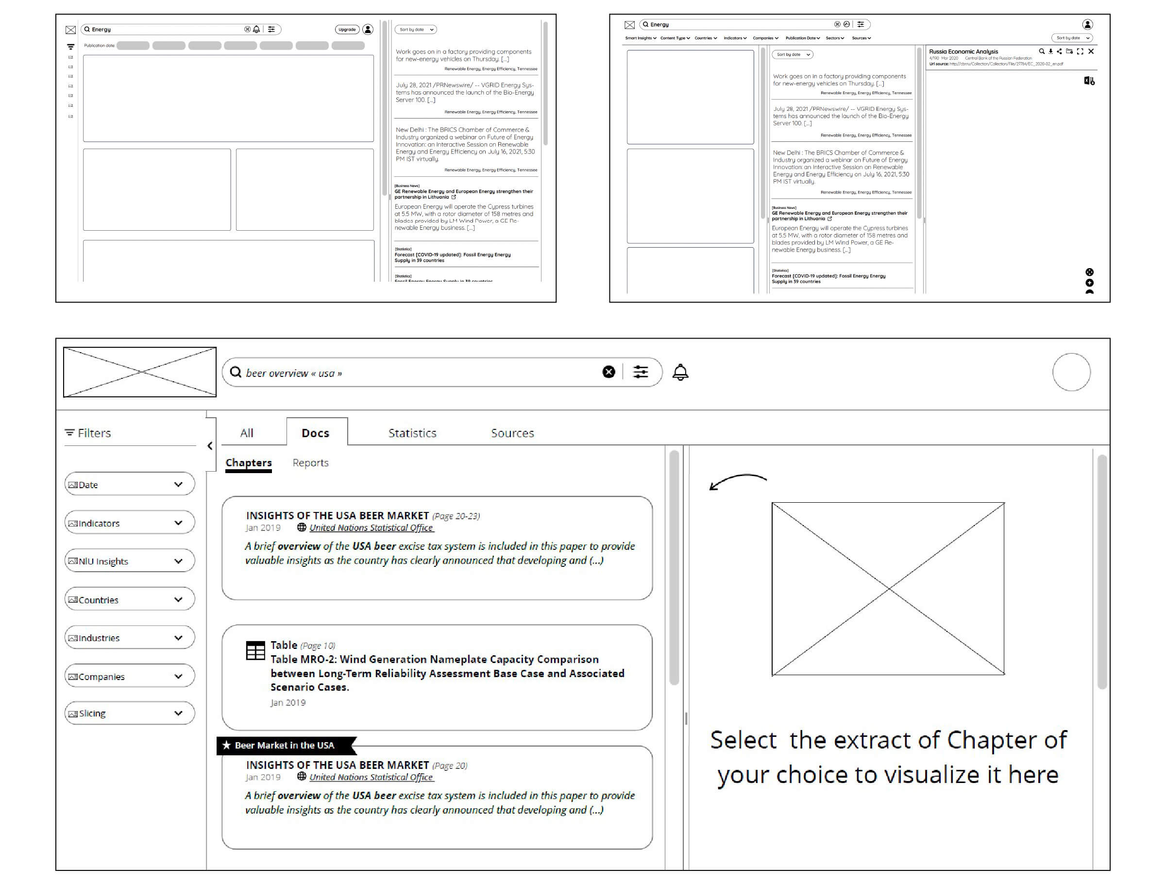
Wireframe Prototype
To validate specific interactions and ensure we were on the right path regarding ergonomics, I created a prototype based on the wireframes.
This enabled us to confirm that the navigation was indeed smoother than before.
Mockups
Next, I began designing high-quality mockups. With the assistance of the product team, we considered all possible scenarios, knowing that testing would uncover further refinements.
During this phase, we identified some navigation issues that had not been apparent in the wireframing process. Previously, we had a clustered page for statistics that displayed a list of countries and units of the stats. The challenge was to simplify this page and incorporate it into the navigation more effectively. To address this, we added a dropdown to the stats section, which presented the same information as the clustered page.
Additionally, users could now search for specific keywords, saving them valuable time.


Prototyping
After validating the design of the mockups, I proceeded to create a new high-definition (HD) prototype.
The purpose of this additional prototype was to revalidate interactions, as there had been some adjustments since the wireframe stage, and we wanted to confirm their effectiveness. This step enabled us to assess whether the new design offered a simpler and faster way to search compared to the previous version.
This realization led us to simplify the setup configuration even further, ensuring a more streamlined and efficient user experience.


Integration of the UI
The Front team typically establishes the code’s foundation and refines the structure of the stylesheets.
Following that, I fine-tune the design within the code. I utilize the terminal to connect to a personal VM (virtual machine), and for this project, we employed Bitbucket, a web-based platform for version control and collaboration.
The outcome
Enhancing User Engagement Beyond MVP1
Following the release of our initial version (MVP1), we leveraged data from Google Analytics, comments in our NPS, and Hotjar to identify areas in need of improvement.
We noticed a significant increase in click rates within our ‘Reports’ tab, while our ‘Statistics’ tab saw a substantial decrease in user engagement.
As a result, we made the strategic decision to merge these two tabs, further enhancing the user experience.
Throughout this iterative (agile) process, I continued to collaborate with the product team to oversee progress and implement refinements, extending our efforts well beyond the initial release, even several months afterwards.